
ROMA ETERNA HOTEL LANDING PAGE
Project Overview
Client: Roma Eterna Hotel (Luxury Hospitality)
Project Scope: Redesign of the property’s main landing page
My Role: Lead UX/UI Designer, working alongside stakeholders (hotel management) and a small support team
Objective: Create a visually compelling, user-friendly landing page that increases direct bookings and showcases the hotel’s luxury appeal
Introduction
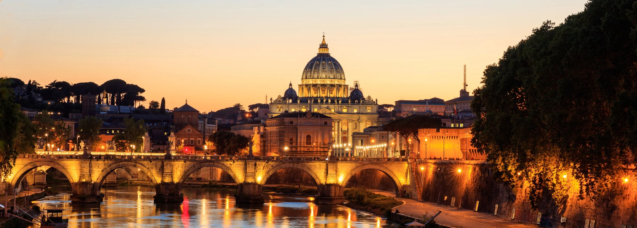
Roma Eterna Hotel is a 4-star luxury property in Rome. Its previous online presence suffered from poor navigation, lackluster visuals, and ambiguous booking pathways, pushing potential guests toward third-party platforms. The goal: create a sophisticated and user-friendly landing page that highlights the hotel’s unique Roman heritage, entices direct bookings, and reinforces brand loyalty.
Research Phase
User Surveys & Feedback
Recent Engagement: 77.7% of respondents had used a hotel website in the last three months.
Pain Points: Confusing date pickers, slow load times, hidden fees or insufficient price transparency, and cluttered booking flows.
Preferred Platform: Booking.com was widely mentioned as easy to use, indicating a strong need to simplify direct booking on the hotel’s site.
Competitive Analysis
Benchmark Hotels: J.K. Place Roma, Hotel Palazzo Manfredi, Villa Laetitia.
Key Observations:
Luxury hotels generally convey a high-end feel with professional imagery and minimalistic designs.
Calls-to-action and performance are often overlooked; site load times and CTA placement can deter users.
Customer Journey Mapping
Emotional Rollercoaster: Enthusiasm at the homepage, frustration setting in during room selection or when adjusting dates.
Friction Points: Ambiguous room descriptions, unclear loyalty benefits, cumbersome date-change process.


(User Survey)

(Competitive Analysis)


Ideation
User-Centric Goals
Prioritize direct-booking features: prominent “Book Now” or “Check Availability” elements.
Reduce cognitive load: clean layout, easily scannable sections, and no hidden fees.
Brand Alignment
Honor the luxurious Roman identity: refined color palette (gold, cream, navy), classic serif typography for headings, high-quality images showcasing interiors.
Integrate storytelling: highlight Roman culture, local experiences, and unique hotel amenities.
Wireframes & Prototype
Low-Fidelity: Focused on straightforward layout with hero image, succinct introduction, and visible CTA.
Mid-/High-Fidelity: Introduced gold accent lines, robust image blocks, and clear icons to break up text.
Design
Visual Hierarchy & Aesthetics
Hero Section
Striking interior shot featuring opulent lighting and marble floors.
Prominent hotel name overlaid in an elegant typeface, accompanied by subtle star icons.
Color & Typography
Gold Accents for headings, borders, and callouts—underscoring the hotel’s upscale nature.
Clean Fonts: A modern, legible sans-serif for body text; tasteful serif for headings.
Content Structure
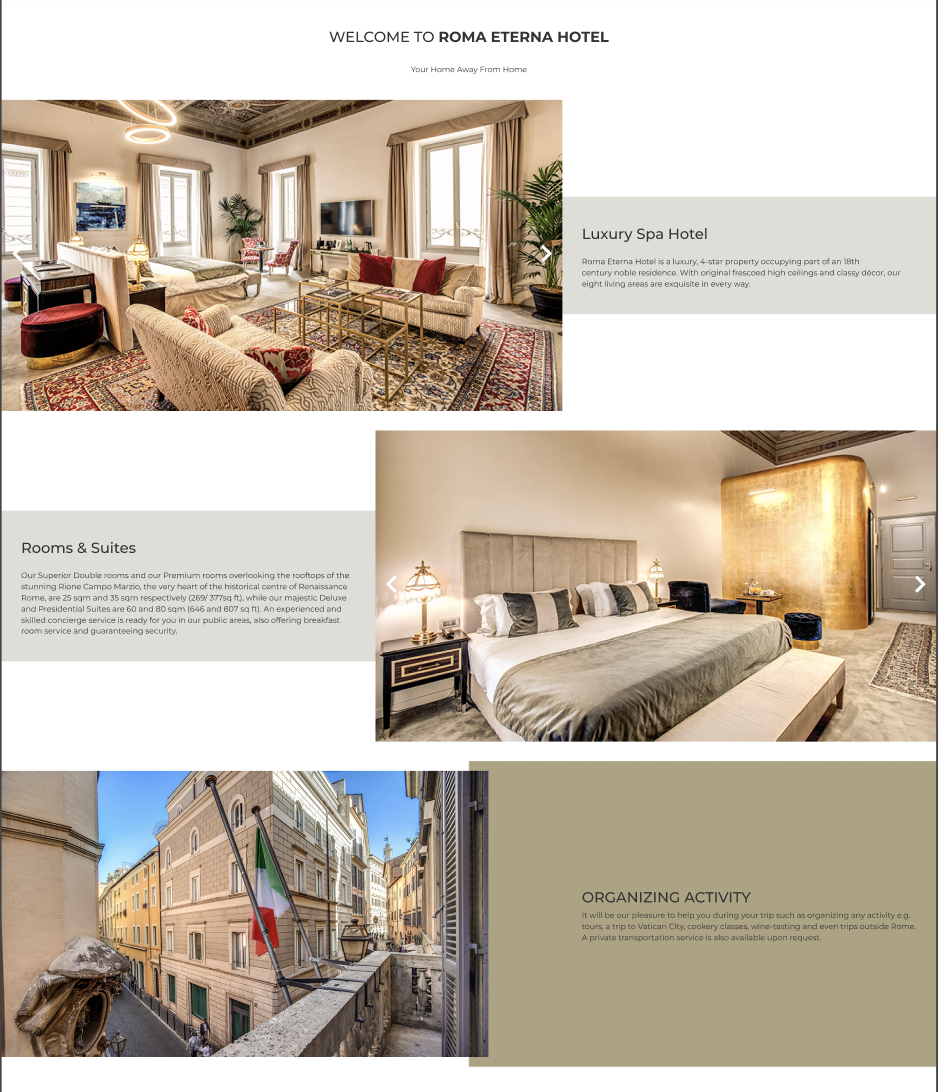
Luxury Spa Hotel Block: Clear subheadings, large photos of the spa and bar areas, short paragraphs describing USPs.
Rooms & Suite / Prestige Suites: Image-driven presentation with minimal text, highlighting design details and comfortable amenities.
Experiences & Breakfast: Incorporated a subtle map of Italy, tying the hotel to Rome’s cultural heritage and presenting local experiences.
Request Info: A streamlined form fostering direct communication.
Partner Badges: TabletHotels, HotelsCombined, etc., to build user trust at a glance.
User Engagement Elements
Social Media Integration: “Share Your Moments” gallery that encourages user-generated content.
Awards & Reviews: Quick references to accolades, removing the doubt potential guests might have.
(Before Redesign)


(First Mockups version)


FINAL MOCKUP VERSION
KEY PERFORMANCE INDICATORS
Direct Booking Rate
Early user tests suggest a higher intent to book directly, as the CTA stands out and essential details are transparent.
Bounce Rate
With a cleaner, faster-loading landing page, initial data indicates a decrease in the bounce rate on desktop and mobile devices.
Time on Page
The improved layout and richer visuals (maps, photos, short blurbs) have modestly increased user engagement.
Form Submissions
More frequent “Request Info” submissions, pointing to greater user trust and clarity around next steps.
Challenges & Learnings
Balancing Luxury & Performance
High-resolution imagery and animations can slow down page loading. Ongoing optimization—especially for mobile—is mandatory to maintain user satisfaction.
Keeping It Simple
The biggest pitfall was the temptation to overload the site with decorative elements. Striking a balance between aesthetics and usability demanded strict editorial control.
Iterative Testing
Small sample sizes can introduce error margins. Consistent, larger-scale user tests (A/B testing, heat mapping) are critical for validating design improvements.
Loyalty Integration
Users need a clear value proposition for signing up to loyalty programs. Subtle prompts and short sign-up forms are more effective than lengthy or pushy dialogues.
Conclusion
Roma Eterna Hotel’s landing page overhaul addresses historical issues: unintuitive booking flows, obscured brand identity, and lack of direct conversions. By adopting a user-first approach—through thoughtful research, crisp ideation, and deliberate visual enhancements—the design now resonates with the luxurious essence of the hotel while simplifying the path to booking.
However, no single redesign guarantees success indefinitely. To be direct: complacency will kill these gains. Ongoing optimization, with frequent user feedback and analytics monitoring, remains non-negotiable. The current improvements set a solid foundation for boosting direct bookings and fortifying Roma Eterna’s online presence, but continuous refinement is key to sustained success.