
Roma Eterna

UI/UX
INTRODUCTION AND GOAL
Perched in the heart of Rome, Roma Eterna Hotel sought a landing page as splendid as its marble floors and vaulted ceilings.
My Goal: craft a digital entryway that matches their old-world glamour, modern convenience, and elevated guest experience.
RESEARCH PHASE
User Feedback: Guests cited friction in direct booking flows and found the old site visually flat—unworthy of the hotel’s actual atmosphere.
Luxury Market Insight: Benchmarking J.K. Place Roma and other top-tier properties revealed that opulent photography and frictionless user pathways are a must in the high-end hospitality space.
Customer Journey Mapping: Highlighted emotional highs and lows, pinpointing friction points in booking flows and date adjustments.


IDEATION PHASE
Wireframes emphasized a hero section capturing the grandeur of Roman architecture, immediate booking prompts, and simplified rate details—conveying transparency and trust to prospective guests.


(Before Redesign)
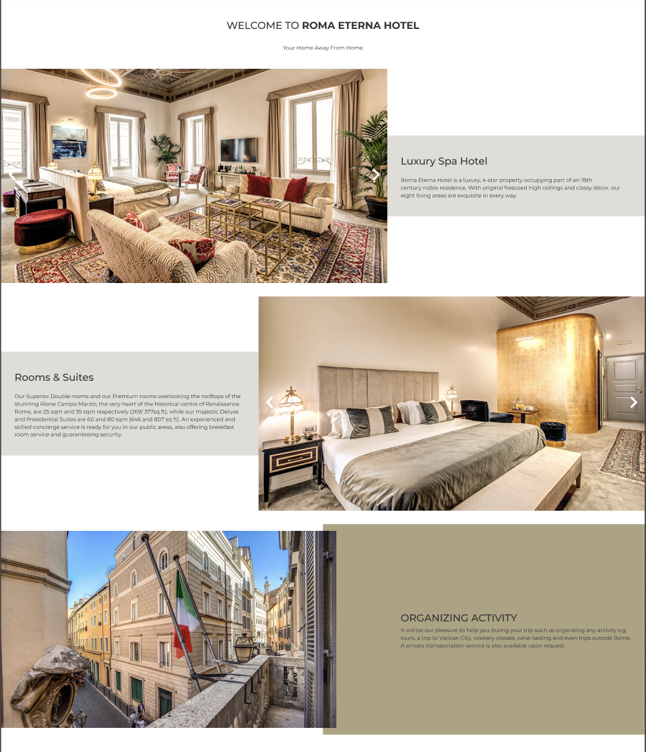
DESIGN PHASE
Visual Hierarchy: Gold accent lines and artful serif headlines exude quiet opulence. High-resolution images transport users into the hotel’s sumptuous world.
User Journey: Every scroll reveals thoughtful content blocks, from curated experiences to booking tools, ensuring a balanced blend of storytelling and functionality.


(Lo-Fi Wireframes)
FINAL PRODUCT AND OUTCOME
Boost in Direct Bookings: Prominent “Check Availability” calls to action reduced abandonment, driving more reservations.
Lower Bounce Rate: Breathtaking visuals and intuitive design tempt visitors to linger longer.
Reinforced Brand Identity: In marrying modern UX with timeless Roman style, Roma Eterna distinguishes itself among discerning travelers.